Design Year Book |
| Posted: 27 Oct 2011 10:46 AM PDT 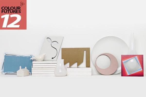 It's October now, and the world's largest paints company, AkzoNobel (Dulux) is releasing their Color Futures 2012, which present one dominant trend and five relating trends. The single color that best sums up the prevailing mood, attitude and fashion of the time is deemed the Color of the Year 2012.
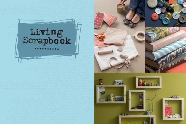 Trend 1: Living Scrapbook Our preoccupation with documenting and sharing our lives has become multi facetted with the likes of Facebook, Twitter, MySpace and a myriad of blogs all allowing you to invite people into your personal, self designed zone. This culture of showcasing 'who I am' has crossed over into the physical world and influenced how we present ourselves through our homes. This palette reflects the quirky aesthetics of blogs and social media. Happy, yet mature pastels beloved by designers like Ray and Charles Eames. This collection is modern but ever so slightly degraded and non-mainstream. 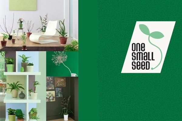 Trend 2: One Small Seed We can't save the world on our own, but we can enjoy the small wander of nurturing our own plants at home and creating new life from one small seed. Growing our own food helps us reconnect with the importance and delicate balance of nature. Plants are no longer simply decoration but a vital part of our interior environment. Nature inspires a palette of watery greens, fresh sky blue and earthy neutrals with deeper accents of dark soil, leaf green and bright pink and red blooms. Which one will you choose? 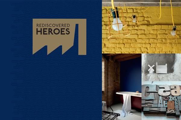 Trend 3: Rediscovered Heroes Hard times have their advantages; they prompt us to look around at what is already there and find new ways of using it. Abandoned buildings and discarded objects are re-invigorated and re-imagined to create useful and individual design. It's time to celebrate the humble lamp post, paperclip and milk bottle as heroes of design. This palette rejoices in the down to earth colors of our industrial heritage. Denim blue, rusty metal tones, concrete grey and sewing machine green are accented with signal brights inspired by the bold hues of wires and pipes. 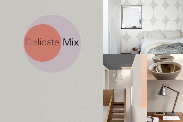 Trend 4: Delicate Mix In times of turbulence we are attracted to design which offers silence and visual stillness. Very simple, beautifully made pieces are a real luxury and exude subtlety and refinement. A juxtaposition of materials creates the perfect balance and the smooth lines and polished surfaces demonstrate the love and care that has been taken to produce them. If you're feeling elegant and understated, these might be the colors for you. Refined neutrals, warm caramels, and blushing corals paired with polished concrete, wood tones and a hit of copper orange to add spice. 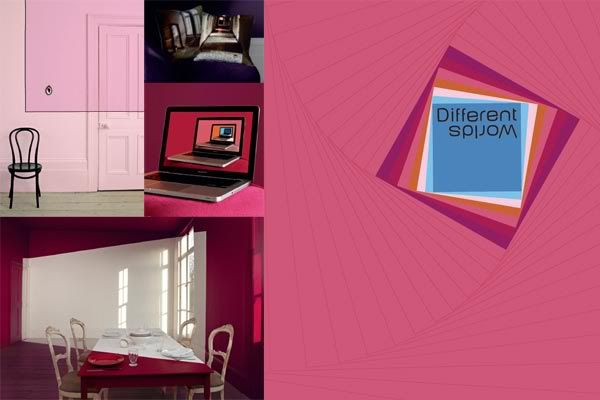 Trend 5: Different Worlds We have always been fascinated with the idea of exploring the line between fantasy and reality. Ever since Lewis Carroll's Alice dropped down the rabbits hole we have been enjoying weirder and more wonderful worlds and today's technology allows us to inhabit several worlds at the same time through gaming, Skyping and 3D movies This color palette is dreamy and surreal. Choose from lush blues, greens and reds or set your sights on a delicate, ethereal pastel. 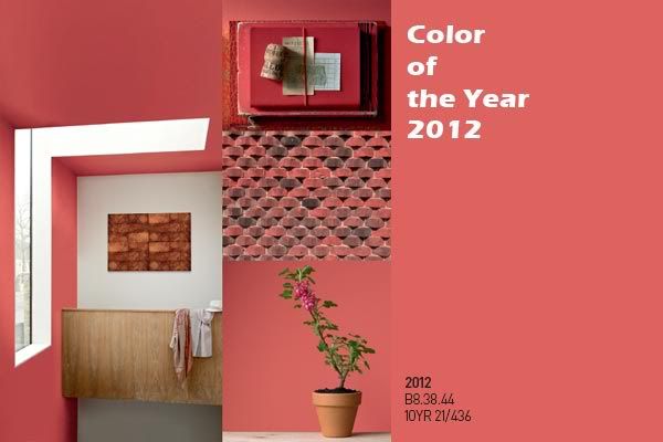 Color Of The Year This radiant shade is the most important color for 2012 as it is at once whimsical and serious, dynamic and soft, perfect for a tiny accent or for a feature wall. Red is held in high regard around the world. In China, it is associated with good fortune; in India it signals marital bliss and insightfulness.
Subscribe to:
Post Comments (Atom)
|

No comments:
Post a Comment